
A KPI card is a single design component — one metric, one visual — that gets placed inside a larger dashboard alongside charts, tables, and filters. It’s often the smallest element on the page, and the most-viewed. Before anyone scrolls to a trend line or drills into a table, they read the big number. That’s why KPI card design matters so much: it has to answer “how are we doing?” in under two seconds, on its own, before the rest of the dashboard adds any context.
At Grafieks, we’ve been rethinking how individual KPI cards are designed so they can be dropped into any dashboard, in any BI tool. Most reporting platforms default to one flat card layout everywhere: a label, a number, maybe a percentage underneath — and call it done. But a single value on its own is only half the story. That’s why we built a library of KPI card templates: standalone KPI designs, not full dashboard templates, that go beyond a basic period-over-period comparison and let the number carry its own story wherever it’s placed.
Template-based KPI cards vs. manual design in BI platforms
If you’ve built dashboards in Power BI, Tableau, Looker, or similar tools, you know the usual workflow for a single KPI: drop in a card visual, format the font, add a comparison measure, tweak conditional formatting, then repeat that process for every KPI card on the page. It works, but it’s slow, inconsistent across teams, and easy to get visually wrong.
Manual design tends to run into the same problems:
- Inconsistency: every analyst formats cards slightly differently, so dashboards from different teams never quite match.
- Time cost: building conditional formatting, icons, and progress indicators from scratch for every metric adds hours to every report.
- Missed context: under deadline pressure, it’s tempting to ship a plain number instead of the badge, gauge, or trend line that would make it meaningful.
- Maintenance overhead: when design standards change, every manually built card has to be updated individually.
Pre-built KPI card templates solve this by separating the design decision from the data connection. Instead of designing each card from a blank canvas, you choose a template that matches the story you want to tell: target achievement, trend direction, or raw performance. The visual logic, spacing, color rules, and iconography are already solved, tested, and reusable across any dashboard, report, or app where that KPI needs to appear.
This doesn’t replace design skill; it front-loads it. The thinking that would normally happen per-card, per-report happens once, in the template, and the result is a self-contained KPI design you can add to whichever dashboard needs it.
Why do single-value KPIs need more than a number?
Showing “Sales: 648k” tells you what happened. It doesn’t tell you whether that’s a win. The moment you add a target, a goal, or a visual cue like color and iconography, the same number becomes a decision-making tool rather than a data point.
8 KPI card templates you can add to any dashboard
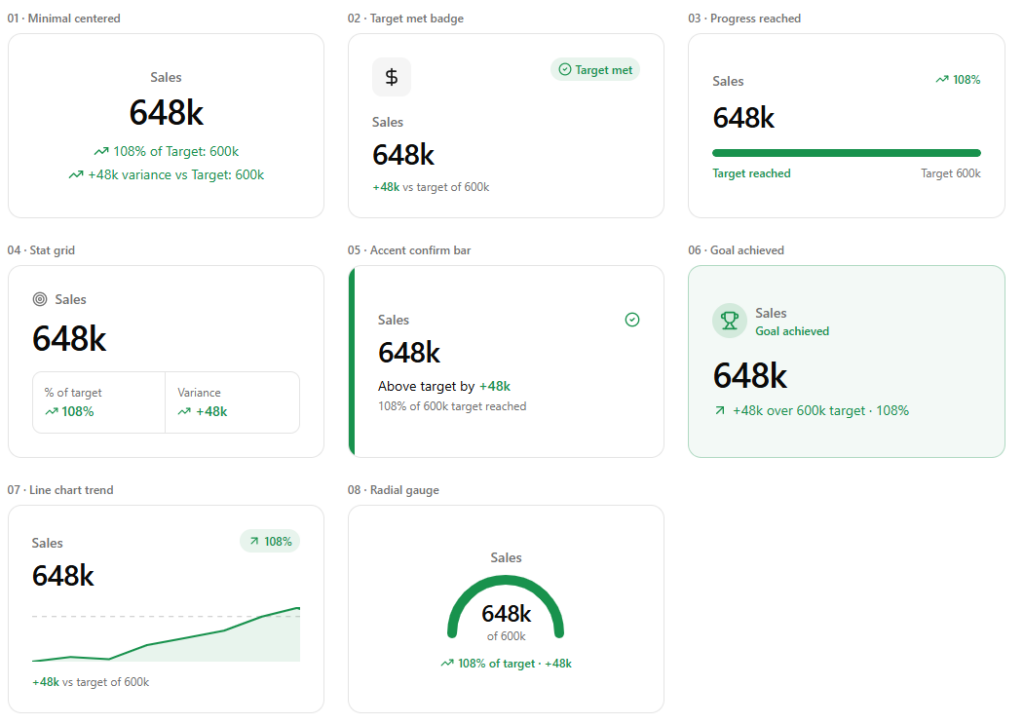
- Minimal Centered: A clean, centered layout pairing the metric with percentage-of-target and variance. Works well when the surrounding dashboard already has a lot of visual noise.
- Target Met Badge: An icon block plus a status badge instantly flags whether a goal was hit, so the viewer doesn’t have to calculate anything.
- Progress Reached: Turns the KPI into a mini progress bar with the number, percentage achieved, and labeled target — ideal for “how close are we to the finish line” stories.
- Stat Grid: Splits the card into two supporting stats in a bordered grid beneath the headline number. Data-dense, good for analyst-facing reports.
- Accent Confirm Bar: A bold color bar with a confirmation checkmark draws the eye immediately to cards that need attention.
- Goal Achieved: A full-card tinted background celebrates a milestone. Best reserved for KPIs where hitting the number is genuinely significant.
- Line Chart Trend: Adds a sparkline beneath the number, so the metric shows trajectory, not just a snapshot.
- Radial Gauge: A semi-circular gauge visualizes progress toward target directly around the number, combining a single value with an intuitive dial read.
Choosing the right KPI template
- Minimal Centered or Stat Grid for dense executive dashboards where each card has to compete for limited space.
- Target Met Badge, Progress Reached, or Radial Gauge for explicitly goal-driven KPIs.
- Accent Confirm Bar or Goal Achieved to draw attention to a metric that deserves emphasis.
- Line Chart Trend when trajectory matters as much as the current value.
The bigger idea
A KPI card shouldn’t just repeat a number back to the viewer; it should tell them, at a glance, whether that number is good news. Because each template is a standalone KPI design rather than a full dashboard layout, you can drop it into any dashboard, report, or app and get there faster and more consistently than by designing every card manually in your BI tool, without sacrificing the flexibility to pick the right story for each metric.
Explore these KPI card templates and more at Grafieks.
