
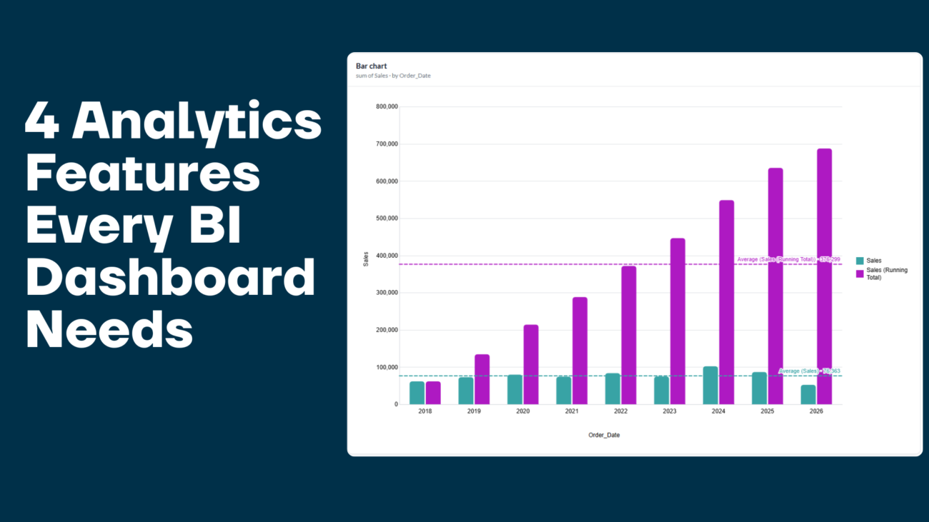
A dashboard can show you a number. Analytics tell you whether that number is good.
$482,000 in revenue means nothing on its own. Is that up or down from last month? Does it represent 12% of your annual target or 40%? Is one region carrying the whole company, or is growth spread evenly? These are the questions business intelligence exists to answer, and they’re exactly why we’ve added four new capabilities to Grafieks: period-over-period comparison, running totals, percentage of total, and reference lines.
Individually, each is a well-established business intelligence technique. Together, they turn a static chart into something a business user can actually act on without writing a formula, waiting on an analyst, or exporting to Excel. Here’s what each one does, when to use it, and how it works inside Grafieks.
Why Raw Numbers Aren’t Enough for Modern BI
Most dashboards fail for the same reason: they display data, not context. A bar chart of monthly sales tells you what happened. It doesn’t tell you whether that’s an improvement, how it contributes to the bigger picture, or whether it’s within an acceptable range.
Self-service BI platforms have spent the last decade optimizing for speed: connect data, drag a field, get a chart. The next frontier is analytical depth: making the interpretation self-service too, not just the chart-building. That’s the gap these four features close.
1. Period-over-Period Comparison
A number becomes much more useful when you can compare it with another period.
Period-over-period (PoP) analysis compares a current period with a previous or corresponding period. Common examples include:
- Month-over-month revenue
- Quarter-over-quarter sales
- Year-over-year growth
- Current week versus previous week
- Current period versus the same period last year
For example, knowing that a company generated €500,000 in sales is useful. Knowing that sales increased 12% compared with the previous quarter provides additional context.
Period-over-period analysis helps users identify whether performance is improving, declining, or remaining relatively stable.
Grafieks now supports period-over-period comparison as part of its analytics capabilities, making it easier to incorporate historical context directly into analysis rather than calculating comparisons separately.
2. Running Total
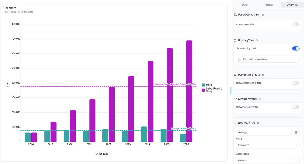
A running total shows the cumulative value of a metric over time.
Suppose a company records monthly sales of:
- January: €100,000
- February: €120,000
- March: €150,000
The monthly figures show individual performance. A running total shows cumulative sales:
- January: €100,000
- February: €220,000
- March: €370,000
This is particularly useful for revenue tracking, sales targets, expenses, inventory movement, customer acquisition, and other cumulative metrics.
Instead of asking only, “How much did we sell this month?” users can ask, “How much have we sold so far this year?”
That small analytical difference can significantly improve how teams understand progress toward goals.
3. Percentage of Total
Sometimes the absolute value is not enough. You also need to understand contribution.
Percentage-of-total analysis calculates how much each category contributes to the overall result.
For example, imagine total annual revenue is €1 million:
- Product A: €500,000 — 50%
- Product B: €300,000 — 30%
- Product C: €200,000 — 20%
The absolute revenue figures are useful, but the percentages immediately show the business composition.
This analysis can be applied to products, regions, customer segments, sales channels, marketing campaigns, or other dimensions.
Percentage of total is especially valuable when building dashboards because it helps users distinguish between large absolute numbers and large relative contributions.
4. Reference Line
A chart can tell you what happened. A reference line can help you understand whether the result meets an important benchmark.
A reference line can represent a target, average, threshold, goal, or other benchmark.
For example, a sales dashboard could display:
- Actual monthly revenue
- Monthly sales target
- Average revenue
- A minimum performance threshold
If actual revenue crosses above or below the reference line, the difference becomes immediately visible.
This makes reference lines useful for KPI monitoring, target tracking, quality control, financial analysis, and operational reporting.
Why These Features Matter in Business Intelligence
These four capabilities have something important in common: they add context.
A basic dashboard might tell you:
Revenue: €2.4 million
A more useful BI dashboard can help answer:
Revenue increased 18% quarter-over-quarter, reached 62% of the annual target, and the Enterprise segment contributed 48% of total revenue.
The second view is much closer to how business decisions actually work.
Modern BI is moving toward interactive analysis where users can ask follow-up questions and investigate the reasons behind changes. Grafieks similarly positions self-service analytics around allowing users to explore data through interactive dashboards and governed data sources.
Business Intelligence Use Cases
BI can support almost every business function.
Sales and Marketing
Sales teams can track revenue, pipeline, conversion rates, customer acquisition, and sales performance.
Period-over-period comparisons can reveal changes in sales performance, while percentage-of-total analysis can show which products or regions contribute most to revenue.
Finance
Finance teams can monitor revenue, expenses, margins, cash flow, and budgets.
Running totals are useful for tracking cumulative revenue or expenditure, while reference lines can help compare actual performance with budgets and targets.
Operations
Operations teams can analyze productivity, order volumes, inventory, delivery performance, and service levels.
Dashboards make it easier to identify trends and exceptions before they become larger operational problems.
Executive Reporting
Executives often need a concise view of business performance.
A well-designed BI dashboard can bring together KPIs, trends, comparisons, benchmarks, and supporting analysis so leadership teams can understand performance without manually reviewing multiple spreadsheets and reports.
What to Look for in a Modern BI Tool
When evaluating business intelligence software, look beyond the number of charts available.
Important capabilities include:
- Easy data connectivity
- Data preparation and modeling
- Interactive dashboards
- Self-service analytics
- Flexible data visualization
- Historical comparisons
- Advanced calculations
- KPI and target tracking
- Secure sharing
- Governance and consistent metrics
- AI-assisted analysis
- Real-time or scheduled data updates
Modern BI platforms increasingly combine these capabilities so users can move from data preparation to analysis and visualization in one workflow.
Business Intelligence Is Moving From Reporting to Exploration
The future of BI is not simply about producing more reports.
It is about making data easier to explore.
A static report might tell a manager that revenue fell. An interactive BI platform can allow that manager to compare the current period with previous periods, examine cumulative performance, identify the percentage contribution of each segment, and compare actual results against a target, all within the same analytical workflow.
That shift from reporting what happened to helping users explore why it happened is one of the defining characteristics of modern self-service BI.
Build More Context Into Your BI Analysis With Grafieks
Grafieks is designed to help teams connect data, build dashboards, and explore business information through self-service analytics. Its platform combines data connectivity, visualization, governed data sources, and AI-powered analysis so users can move from data to insight without unnecessary technical barriers.
With newer analytics capabilities such as period-over-period comparison, running total, percentage of total, and reference lines, users can add more context to their dashboards and understand not only what their metrics are, but how those metrics are changing and contributing to overall performance.
The result is a more useful approach to business intelligence: connect the data, visualize the numbers, add analytical context, and turn the resulting insight into action.
If you’re already on Grafieks, open any chart and look for the new comparison options in the Analytics panel. If you haven’t connected your data yet, you can start a free trial and have these analytics running against your own numbers in minutes.
Numbers tell you what happened. Context tells you what to do next, and that’s what good BI is really for.
