

Data visualization is a powerful tool that helps in interpreting complex data sets and conveying information in a clear and effective manner. This document outlines three distinct methods for creating data visualizations, each with its own advantages and use cases. Whether you are a data analyst, a business professional, or a researcher, understanding these methods will enhance your ability to present data insights effectively.

1. Using Visualization Software
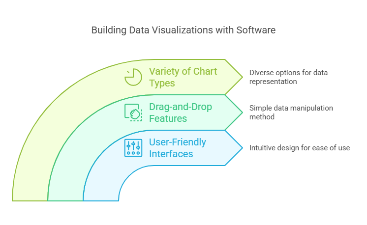
One of the most common ways to build data visualizations is through specialized software. Tools like Grafieks, Tableau, Power BI, and Google Data Studio offer user-friendly interfaces that allow users to create a variety of visualizations without extensive programming knowledge. These platforms often come with drag-and-drop features, enabling users to easily manipulate data and choose from a wide range of chart types, such as bar graphs, line charts, and heat maps.
Advantages:
- Ease of Use: Intuitive interfaces make it accessible for non-technical users.
- Integration: Many tools can connect directly to databases and spreadsheets for real-time data updates.
- Customization: Users can customize visualizations to fit their branding and presentation needs.
2. Programming Libraries
For those with programming skills, using libraries in languages like Python or R can provide a high level of customization and flexibility in creating data visualizations. Libraries such as Matplotlib, Seaborn, and Plotly in Python, or ggplot2 in R, allow for detailed control over every aspect of the visualization process.
Advantages:
- Flexibility: Programmers can create highly customized visualizations tailored to specific needs.
- Reproducibility: Code can be reused and modified for future projects, ensuring consistency.
- Advanced Analytics: Integrating statistical analysis and machine learning models can enhance the insights derived from the visualizations.
3. Online Visualization Tools
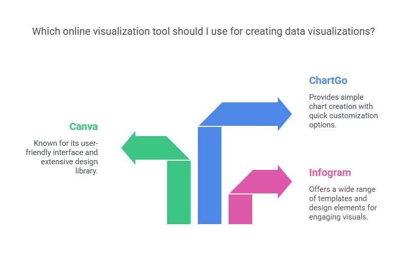
There are numerous online platforms that allow users to create data visualizations quickly and easily. Websites like Infogram, Canva, and ChartGo provide templates and design elements that can help users create visually appealing graphics without needing extensive design skills.
Advantages:
- Quick Setup: Users can create visualizations in a matter of minutes.
- Templates: Pre-designed templates can save time and provide inspiration.
- Collaboration: Many online tools allow for easy sharing and collaboration with team members.
Conclusion
Building effective data visualizations can significantly enhance the communication of insights derived from data. Whether you choose to use visualization software like Grafieks, programming libraries, or online tools, each method has its unique strengths. By selecting the right approach based on your skills and project requirements, you can create compelling visual narratives that drive informed decision-making.
